Utilizing the screen properly and microinteractions: Golden rules of mobile UX design
Special to PalmInfocenter.com
User experience, which is commonly known as UX, is one of the most important things a business needs to provide correctly if they are able to have any chance of being successful when providing a product or service.
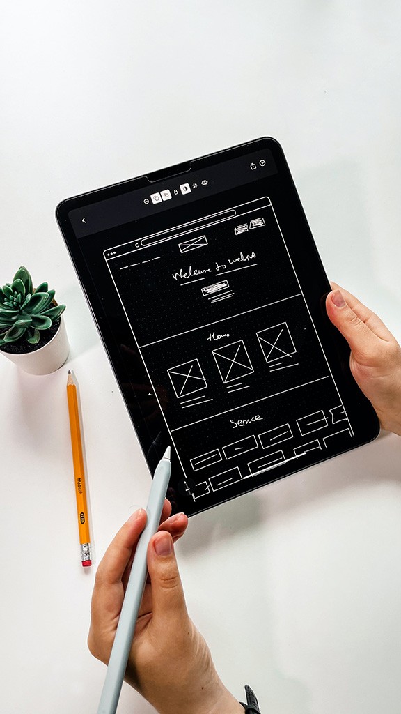
With more and more people continuing to visit websites via a mobile device such as a smartphone, UX has become increasingly more important for businesses as they need to ensure that their website can be displayed in the right way and fits the screen size that is being used.
According to figures that have been collected, mobile traffic accounts for more than half of the total internet traffic whilst a huge 77% of people will use their mobile to search for something even when they have a traditional device such as a desktop computer to hand, with 85% of them thinking a company's mobile experience should be as good or as better than the one provided on a desktop.
 Because of these figures, and the fact that there is an increasing number of different apps being created regularly to help cope with the continued change in consumer behavior, there are a number of golden rules that UX designers need to think of when they design the mobile services.
Mobile means movement
One of the golden rules that need to be followed is to make sure that the design is simple and easy on the eye as people using their mobile devices will typically be on the move and have a rather restrictive screen size.
With users often multi-tasking when using these devices or using them when looking to make time disappear, it is important that the UX provided is eye-catching and as interactive as possible, thus making sure people are able to do what they want in an effective manner. Attention spans can be rather short when it comes to this, as well, therefore it is important everything is on point.
One such example of this is the Unibet app, as this has been designed to be as fresh and clutter-free as possible, whilst also making sure that each feature and potential betting market is as accessible in the shortest possible time, thus enhancing the overall mobile UX when being used by a punter as they will not be frustrated with trying to navigate the app as they look for what they want.
Utilizing the screen properly and optimize the page for touch
Most, if not all, smartphones now consist of a touchscreen that allows users to do whatever they wish by simply tapping on the area that the clickable section appears on. Mobile UX designers need to ensure that they make their site and app with this in mind.
Designers should be looking to try and eliminate any potential typing as much as possible as the keyboard can make users frustrated, especially if they continue to touch the wrong letter, whilst they also need to ensure the links are spaced out in a way that the wrong one does not get clicked. A recent study revealed that people are better at tapping the centre of the screen, thus allowing for targets to be 7mm in size, but those in the corners should be around 12mm.
Provide microinteractions
One way that users can feel that they are getting the best mobile UX possible is by seeing that what they did has worked in an intended way. Web developers are able to show this by providing users with microinteractions. For instance, once a link has been clicked, a symbol could pop up on the screen to show that it is loading, or a bar across the top could show that progress is being made.
Users are known to be impatient when it comes down to slow loading speeds on webpages, and those that cannot see anything happening will likely look to leave the page and never return again.