By: Kerry Lannert
April 20, 2004
Last January Sony announced a new personal information management (PIM) software suite for its Clie line of handhelds called the Clie Organizer (CO). So far the CO is only available on the TH55, presumably it will be available on future models as well. Handhelds with the CO software also include a Windows desktop companion application on the install CD.
Overview
Currently the CO is only available on one handheld, but its inclusion in future devices seems almost certain. While it may not be a major deciding factor for handheld buyers at the moment there's a chance it may make the Clie line more or less attractive to consumers as its presence in the handheld market grows.
The CO implements a tabbed interface for the basic PIM functions as well as a few extras. From the top, the tabs are DateBook, Address, ToDo List, FreeNotes, MemoPad, Viewer, Reference, Applications. Tabs can be highlighted and selected by pressing the back button (highlights the next tab down from the one currently open), scrolling with the jog dial, and selecting the desired tab by pressing in on the jog dial. On a handheld with a button mapped to Clie Organizer (as opposed to any of its individual components), repeatedly pressing that button opens each tab in turn. Overall, the tab interface is very functional, and the tabs don't interfere with the viewable, usable portion of the screen. The text on the tabs may be too small for some with less-than-great eyesight. I'm mildly farsighted and have no trouble reading the tabs without my glasses.
Overall, this suite provides some nice cosmetic changes, including an improved color scheme and icons for recurring items, alarms, notes, and attached free notes. Something users may not notice at first is the absence of the ubiquitous Palm OS menu/title tab at the top left of the screen. Tapping this region still pops up the menu.
Because palmOne has started bundling enhanced PIM applications with their newer handhelds, each section in this review will briefly discuss how the CO compares with its palmOne counterpart.
DateBook
The largest change to the standard Palm PIM suite is the CO's DateBook (DB). It combines many of the features of the standard date book with the ability to stick pictures, free notes, or digital ink writing directly onto the pages of the day, week, and month views. Events can also be assigned a color and an icon from built-in, non-configurable sets.
The DB contains some of the views available in the standard date book, with a few adjustments. There's a day view, week view (not the same as the palm standard week view), a month view, and a 6 month view.
The first time the CO is opened the user is given the option of installing a database of local holidays and a preferred locale. It also provides the option of not syncing the holiday information to the desktop. Holidays can be assigned a color, which is applied to the entire day in week, month and year views.
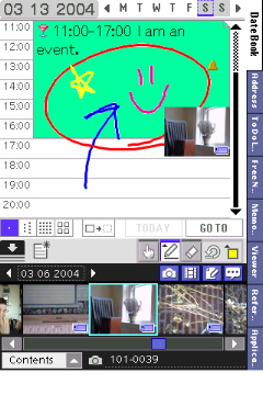
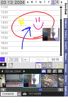
By default the DateBook tab is opened on the day view, with a content panel at the bottom of the screen to navigate through the available picture and free note files on the handheld and any external memory. This panel can also be set to show To Do items and "stickers" that can be stuck on the page like the other pictures and free notes. It's available in day, week and month views. The presence of handwritten data on the screen can be toggled with a button present in all but the 6 month view.
The implementation of the ToDo view in the contents panel is pretty anemic. ToDos can be checked or unchecked, but cannot be edited otherwise. As mentioned previously, all ToDos are shown by default, the option to hide completed items is only available in the main ToDo panel.
The stickers are cute, but very redundant considering that many of them have the same subject matter as event icons. This seems like creating a solution to a problem that didn't exist, something Sony is commonly guilty of doing. A few are marginally more useful, depicting arrows and the like, which might come in handy for those too lazy to just draw an arrow themselves. As a person who does actually enjoy putting stickers on my paper calendars (my Hello Kitty wall calendar came with a huge sheet!), I like this feature for it's silly uselessness and general cutesiness. Those who have no desire to stick a little picture of a strawberry to a date book page will probably not feel the same as I do.
The day view can be adjusted to show 5 different time slot heights. Either low, medium, or high by the hour; or medium or high by the half hour. I find all but the low by the hour to be a waste of space.
Events and images/free notes/stickers can be dragged and dropped around the calendar. Unfortunately, drag 'n' drop is only supported in the day view. This seems like a major oversight, as I rarely need to change the time of an event, but the day or week it occurs on. For example, when a meeting gets rescheduled, it's usually to the next day, not the next hour.
One issue with drag 'n' drop of file thumbnails is that no true association is ever made with the event that you stick a picture on or next to, so if that event is moved or deleted, the notes and picture adjacent remain. This means if you have an event with a big circle around it and a picture tacked on, the circle and picture stick around even if you move or delete your event. To make this a little easier on users, Sony included a function to delete all handwritten data on the current display. Note that it's just the handwritten stuff that goes, not file thumbnails.
The DateBook includes full support for the TH55 jog dial and navigation buttons, and presumably Sony will include support for future navigation layouts on each handheld including the CO software. The user can switch between days (in day view), weeks (in week view), months (in month view) and month pages (in the 6 month view) with the left and right nav buttons. The jog dial sequentially selects events in the day view (switching to the next or previous day when the bottom or top event has been passed) and days in the other views. In the week and month views the lower portion of the display is dedicated to showing the events listed for the selected day. I think this is an excellent use of screen real estate on a hi res+ device, but could potentially be crowded on a square screen.
In the week and month view, when the contents panel is collapsed, tapping on an item can either bring up the details dialog for that item, or switch the user to that item's day view. I think this is a thoughtful touch on Sony's part, and prefer to edit my items directly from the week or month view.
There are several configurations available to users for how they want to view events in the week and month views. This includes choosing to show icons for contents, alarms, etc. And, in the month view, users can choose to show text, a dot or icons for events. This is a nice touch, something I've never seen implemented quite this well in a date book application before. The month screen can seem a little crowded when showing the text of each event (it only shows enough to fill one line per event, usually a word or two), but makes scanning for a particular event much easier than judging by icon alone. Item color, however, is not shown in the text view.
The 6 month view is only good for scanning to find a particular date, as no event information is displayed. Holiday coloration is shown, however. Tapping on a day takes the user to the day view for that date.
One large oversight with the DB is the alarm implementation. It's identical to the standard date book, where one alarm is chosen in the preferences and is used for all alarms. Third party date books have included the ability to select an alarm for each item individually, and since Sony chose to implement other popular third-party features like icons and colors, the alarm scheme would have followed as well.
Overall this date book is a very nice improvement over the Palm standard, but still lacks many of the advanced features available in third-party date book replacements, like Agendus and DateBk5. With that said, I find the CO date book much more pleasant to look at, and its week and month views more powerful to use, than any date book application I've used on a Palm-powered handheld.
When compared with the palmOne enhanced date book, the CO DateBook falls flat in a couple areas. The CO does not include category support nor does it have an agenda view or anything similar. It does, however, have icons and better colorization than the palmOne Calendar.
 Address
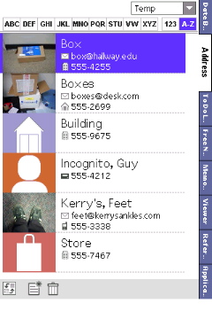
Previous Clies have shipped with an enhanced address book capable of displaying a photograph for each entry. The CO address book is no exception. It also provides 5 built-in icons that can be selected for an entry instead of a photo. Three are colorized "person" icons, 1 is a shopping bag, and one is a building. I found this feature handy in organizing my entries based on their type. It makes scanning through the address book when all entries are shown speedier in some situations.
The default view for the Address tab shows the item icon, the name, two lines of contact information (i.e. phone number, email address, etc) and a contents icon for notes. Sony has also added icons for the various contact fields: a little house for the home phone number, a little building for the work phone number, a pager for the pager number, etc.
The primary contact number for a listing is still selected in a menu in the edit view. However, even though two lines are shown, only one primary contact can be selected. The CO instead selects either the next contact method in the list or the top contact if that's not the primary contact. This confused me at first, but I've gotten the hang of selecting my secondary contact method as my primary contact when it's not first in line. This way, the top contact method (which is usually the primary one) shows up with the secondary contact in the main list view.
The Address tab also allows users to view their entries in the standard list view as in the Palm address book. One modification to both views is the presence of alphabetical tabs along the top of the screen with three letters on each tab (except VW). Left and right navigation buttons scroll through tabs, the jog dial scrolls through the entries for that tab only. To be able to scroll through the entire address book the user needs to select the "A-Z" tab. This tab, unfortunately, doesn't include items that begin with numbers. They get their own tab.
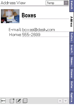 The entry view has some issues. First, it just looks like the edit view, so there are little lines under all the details. When the jog dial is pressed in this view the user returns to the list view. Tapping on the entry view does nothing. To edit the user must tap an "edit" button at the bottom of the display. This is a step backwards from the original address book, and is a regular source of frustration. I've become so accustomed to tapping an entry to edit it that I take 3 or 4 taps before remembering that it doesn't work in the CO.
The address edit screen has been cosmetically enhanced, with improved buttons for adding a note or free note, deleting and done. These buttons do, however, take up much more screen space than the single row of buttons in the standard address book.
The CO address book also comes with the ability to use tap dialing or tap emailing. When enabled, an eligible field can be tapped to produce a dialing window (presumably for Bluetooth-enabled handhelds) or an email composition window.
My absolute biggest gripe with the CO address tab is the lack of a lookup field. I've become accustomed to using the stylus to write in the first few letters of the contact I'm trying to find, and not being able to do this feels very counterproductive. I realize that the CO addres book is intended to be used with one hand and the whole screen (no DIA), but I find scrolling around with the jog dial takes a whole lot longer than just taking out the stylus and writing the name of the person I'm looking for.
The CO Address tab stands up nicely against the palmOne enhanced Contacts application, but they differ so much it becomes hard to compare the two. While Contacts has one-handed lookup (using the d-pad) and more fields that sync with MS Outlook, I prefer the appearance of the CO Address application, the tabbed interface and the photo support. I must admit, however, that since I don't sync with Outlook on the desktop, the additional fields in Contacts aren't a selling point for me, as I achieve the same basic effect (for the most part) using the custom fields.
ToDo List
The CO ToDo List offers some improvements over the Palm equivalent. It combines the standard features (priority, due date, attached notes) with slightly more advanced outlining capabilities. Items can be made siblings, parents, or children of other items, and thus true hierarchical organization of tasks. While this is a welcome addition, it may feel anemic to those who have opted to use more feature-rich task management/outlining programs like Bonsai and ShadowPlan. Folks who've been using the standard to do application, however, will likely be impressed by the improvements in the CO version.
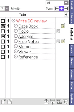 The rest of the CO ToDo List continues with the overall appearance adjustments seen in the other aspects of the CO suite. Included is the ability to show various due date terms (past, present, and future). Item status colors (not started, in progress, deferred) are user selectable from the standard palette. The improved icons for notes are also present as in the other tabs.
As far as hierarchy goes, children inherit the start and due dates of their parent tasks. Outlines can be expanded or collapsed by tapping an icon to the left of each item. Unfortunately, checking all children in a hierarchical list doesn't change the completed status of the parent item, as is standard in third-party task management/outline applications.
Overall, the enhanced CO ToDo List provides functionality not found in the default to do program, and users who haven't needed a full-featured task management application will likely appreciate the improvements here. One problem is the conspicuous absence of the delete button, which is present in most of the other CO applications. Deleting to do items can only be accomplished by deleting their text or through their information dialog (an icon for which is present on the main screen). I don't know how hard it would have been for Sony to include a delete button on this screen, there's certainly room for it on the bottom with the rest of the buttons. This feels like a mistake, mostly because my stylus kept traveling to the bottom of the screen when I wanted to delete something, only to be thwarted by the lack of a button for that task. I was left using the information dialog or (if the DIA was open) selecting the text and deleting it.
Compared with the palmOne enhanced Tasks application the CO ToDo List comes out on top. One place where the CO falls short is in the repeating task department: Tasks supports them, the CO doesn't. Tasks provides users with buttons to filter items by category or date (or nothing), while the CO lets users filter by category and date, and allows users to view items set for the past, present, and future either all at once or in any combination. This combined with the improved hierarchical outlining capabilities of the CO ToDo List make it a much more feature-rich and productive than palmOne's Tasks application.
 FreeNotes
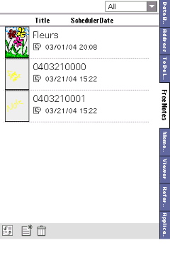
The CO FreeNotes is a significant improvement on the Palm standard NotePad application. While NotePad does not include support for background and pen color options, CO has both of these. It also uses a more advanced system of providing readable line thickness. Rather than having a larger brush size to provide a thicker line (as NotePad does), FreeNotes instead keeps the brush size at 1 pixel and then thickens as the line is being drawn. This makes for very smooth, legible handwriting. One drawback is that loading large notes can take a little while as each line is thickened every time a note is opened the version that's saved is the 1-pixel line base version.
I have a free note gripe that actually extends to the majority of the CO as a whole. When choosing to attach a free note to an item in the date book, address book, etc., the user is taken to the main free notes page, where a new note can be created. Free notes created for attachment to other items appear in the main free notes list. This is different from the standard note dialog, which is the same as the note dialogs used system wide. I prefer tapping a button to add a note any kind of note and immediately being able to write that note, rather than having to effectively go through another application to do it. Plus, having a bunch of notes that only make sense relative to the item they're attached to sitting in my free notes tab feels like a waste of space. The upside to this system is that it's possible to attach a single free note to multiple items.
 MemoPad
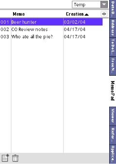
The CO MemoPad has been only marginally improved from the Palm standard application. In addition to the graphical upgrade seen throughout the CO, Sony has added support for 32k memos, a column in the list view for creation or modification date. This last column can be changed between those two or turned off using a small button above the scroll bar. It doesn't take up a great deal of screen space and I find it to be a useful addition. Notes can be sorted alphabetically, by creation date, or by modification date. A small trash icon for deleting memos has also been added to the list view. Tapping on the trash icon brings up a checklist view where multiple items can be marked for deletion, viewable by category.
The memo edit screen doesn't have any bells and whistles, only allowing the user to change the font size for viewing/editing their notes. A separate font size is user-selectable for the list view. Column sizes are not adjustable.
The CO MemoPad isn't much more functional than the palmOne Memos application, they both have support for 32k memos, and the same general functionally. The only thing the CO has that makes it better than Memos is the ability to sort by creation date or modification date, in addition to alphabetically.
 Viewer
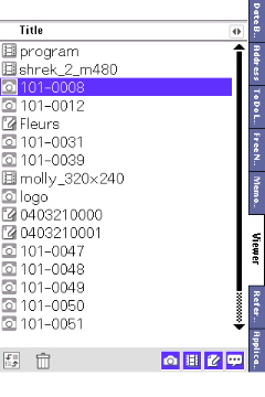
Most Sony handhelds come with Clie Viewer built-in. This is an application where users can view, delete, or edit the information for their various multimedia files. I've noticed that the Clie Viewer on my handheld doesn't show my free notes, while with Viewer tab in the CO does. The Viewer tab, on the other hand, does not provide users with the ability to rotate images as the Clie Viewer does. Tapping on an item in either list or thumbnail views opens it. This is handy, as it is not necessary to use the built-in Clie Viewer or movie player applications to quickly access visual content.
Unfortunately, categorization of these files is not possible in the CO Viewer, but there is a set of buttons to choose which file types are listed. Any file can be sent by Clie Mail or beamed from within the CO Viewer, only without the snazzy buttons used in the Clie Viewer.
Reference
The reference application is effectively a PDF viewer with a non-user-configurable set of documents. It comes with a US/SI conversion table, a clothing/jewelry size table, and an overview of annual precipitation and temperatures for 8 major cities (Tokyo, London, New York, Los Angeles, Paris, Madrid, Rome, and Berlin).
These documents can be removed from the handheld to save space, but new documents cannot be added. I presume that this document viewer is Picsel-powered, and is acting as a Picsel showcase of sorts. Hopefully more reference data will become available in the future. But I digress.
The real problem with the Reference tab is that these are documents, big ones, not databases. You need to zoom in to read anything, and have to pan around the screen with the stylus to get all the information you may want. The files are sort of hard to see below 100%, which means roughly a quarter of a page is viewable at any given time when actually viewing at full size.
 Most of the data can be found for third-party database viewers pretty easily, so this set doesn't seem very special or noteworthy to me. But if you ever need to know the average precipitation of Madrid in August, you're set. For the record, it's almost nothing.
Applications
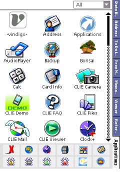
The Applications tab looks dishearteningly similar to the standard Palm application launcher, with two differences. First, the lack of a top tab and the subtle thin gray lines of the CO have replaced the Palm standard interface. Second, a thumbnail panel resides at the bottom of the display for shortcuts to 16 applications of the user's choice.
Desktop
The companion Windows desktop is essentially a clone of the handheld application, with the same basic appearance and tabbed interface. The same information visible on the handheld is visible on the desktop, the desktop even provides a "preview" screen so that you'll know how your events and other information will appear on your handheld's screen.
Conclusions
Overall the CO makes a good replacement for the standard Palm PIM applications, providing improvements throughout. It seems a little bloated at times, however, and not fully realized. The viewer, reference, and application launcher tabs seem to have been implemented almost as an afterthought, and provide less functionality than applications already included on Sony handhelds (Clie Viewer, Picsel Viewer, and Clie Launcher, respectively). I'm very fond of the date book interface and features, however, and have found myself inclined to use it more than DateBk5 (which I still keep installed, just in case). While I miss my custom icons and ability to link contacts to my events, I really like the way the CO DateBook looks and feels, and I'm realizing that maybe I didn't need the features in DateBk5 as much as I thought I did.
Users already accustomed to full-featured, third party PIM software suites will probably not find the CO to be an improvement over their current systems, especially with the glaring absence of a "Today" view or list view in the date book. However, those who have been using the Palm standard PIMs and are contemplating a handheld upgrade may find this suite to be an improvement. Sony has tailored it to be a replacement for a launcher, a main interface for the organizer as a whole, and if I wasn't already accustomed to my own favorite launcher, photo viewer, and reference applications it might serve that purpose for me, as well. As it is, however, the CO isn't a particularly compelling reason to buy a Sony handheld (namely, the TH55 for now) on its own, but if it's added to a lower-end product in the $150-$250 price range, it could become a deciding factor for some users. At this point the CO feels like it's still in its infancy. I'm looking forward to seeing what happens in future revisions.

|
PROS
|
CONS
|
|
|
Overall Rating: 6.5/10
Article Comments
(17 comments)
The following comments are owned by whoever posted them. PalmInfocenter is not responsible for them in any way.
Please Login or register here to add your comments.
![]() Comments Closed
Comments Closed
This article is no longer accepting new comments.
Clie Organizer is unusable
But what makes it unusable is how slow it it. With a few hundred items, it takes 15 seconds (!) to switch into its ToDo list. Presumably, that's because it needs to/tries to synchronize with the Palm's built-in ToDo list. Actually, some other PIM add-on's have the same problem--it's probably due to POS--but that doesn't make it any more tolerable.
It takes a lot of effort to disable Clie Organizer, but it can be done. You can remap the first three hardware buttons to the standard applications. To remap the fourth, you need a piece of software called "THeGoGo".
Clie Organizer still insists on inserting itself into the "Find" output. To get rid of it there, use "Find Hack", which lets you select which applications to search through (again, this is really a design problem with POS).
When you have done all that, you'll still get two alarms for every alarm that you set: one from DateBook and one from Clie Organizer. I haven't been able to figure out how to turn that off.
Another problem is that, in order to be able to add information to the standard databases, Clie Organizer apparently adds odd looking strings into attached notes. If you commit to using it and Clies, and if Sony keeps supporting this, this may not be a problem. For me, it is.
Even though it has problems of its own, Clie Organizer could have been a good first attempt at a new generation of PIM applications for Palms. But the limitations of PalmOS make it unusable for the kinds of people who most need an improved PIM application--those with any reasonable amount of data.
I only wish I could remove Clie Organizer from flash permanently and replace it with some application I actually use. As it is, the TH55 can be turned into a decent handheld (great hardware, iffy software) with some effort, but you'll still get reminded pretty regularly of the presence of a pretty substantial piece of software that, as far as I'm concerned, is only a nuisance.
RE: Clie Organizer is unusable
According to FileZ - I have 2212 Datebook Entries, 450 Address Book entries, about 1 meg of Mapopolis maps, about 1 meg of Docs to go. I don't use the To-Do List, I have over 100 Memo records. I currently have a T-615 - I'm getting mixed signals, is the TH going to be noticably slower or noticably faster than my 615??
RE: Clie Organizer is unusable
I suspect that the TH would be faster running the standard Palm apps, but much slower if you access that data through the Clie Organizer.
Keep in mind that the TH still has the original Palm applications installed--you don't have to use the Clie Organizer software.
RE: Clie Organizer is unusable
RE: Clie Organizer is unusable
1.- The neat feature that allows you to color your appointments is worthless because the colors will dissappear from your CLIE Org. after syncronizing.
2.- The icons are worthless too because they will disappear too after syncing with Outlook.
Other issues includes the fact that you cannot make an appointment last for more than one day, i.e. you cannot make an apopointment starting at 8:00 AM Tuesday and ending at 4:00 PM Thursday.
Overall I find the TH-55 a nice toy, but falls very short of being a business tool.
Back to Palm OS!
Other Applications are 'cons'
You have a bunch of folders with the files the way Sony wants the applications ordered into. You can choose big or tiny icons and you can assign apps to launch in the quick launcher area. Oh yea, you also get to wait many times longer for it to load (appear) everytime over the Palm OS launcher. Don't really understand their thinking on this one. Knowing all the visual features found elsewhere in the CO area, you would think there would be all the normal launcher features plus the ability to insert a snap shot into the background (don't use that feature personally in the other aftermarket launchers), etc...
-----------------
My wife has to sell a lot of candles (www.ccandles.com) to buy her new Palm.
RE: Other Applications are 'cons'
RE: AgendusOther Applications are 'cons'
I had a TH55 for 2 weeks and I was happy to return it.
Cheers
"Life is Too Short"
Tungsten T3-Sony ericsson T610,HBH-60,SanDisk 256Mb Sd Card
RE: Other Applications are 'cons'
Clie Org sync
It also almost always froze when syncing (i have a couple of thousand entries in both contacts and calender).
So it was not worth the hassle of working with (and the recent patch did all contacts to sync for the first time - but not the calender).
keith
Sounds about right...
I think I'll continue to stay far away from them, thanks. *clutches her T|E*
It's not like you *have* to use it...
But the CO is not the reason to buy the TH55. For a price-to-feature ratio unseen since the N760C came out, you get a large screen VG setup, small thin pocketable size, MP3 player, movie player (and recorder if you already 'have' the software), camera, voice recorder, and enough RAM for your very favorite 3rd party apps.
I am totally thrilled with the unit, and haven't even looked at CO since the first couple of days. If you pass this unit over just because of CO, it'd be like passing over a Ferrari just because you didn't like the floormats.
RE: It's not like you *have* to use it...
RE: It's not like you *have* to use it...
The T3 has tweaked versions of the regular apps, which seems like a better idea to me. It's also got a brighter screen (at least one of the screens they use is), a faster processor, double the RAM, and a more normal IMO useable layout.
On top of that, the T3 is usually $30 cheaper.
RE: It's not like you *have* to use it...
Besides, Sony released a bug fix for the CO about two weeks ago that fixes the duplicate alarm problem (which is why I didn't address it at all in the review, there's no point mentioning a bug if it's been fixed).
--------------------------------------
"Well, if it isn't the leader of the wiener patrol, boning up on his nerd lessons"
http://stirwise.com
RE: It's not like you *have* to use it...
It helps a little, but it still has problems. The way the T3 adds additional information to records also is not compatible with other Palm devices and desktop software.
Ultimately, the whole Palm database architecture is just rotten: it's slow and it is nearly impossible to extend databases cleanly and reliably with additional information.
Latest Comments
- I got one -Tuckermaclain
- RE: Don't we have this already? -Tuckermaclain
- RE: Palm brand will return in 2018, with devices built by TCL -richf
- RE: Palm brand will return in 2018, with devices built by TCL -dmitrygr
- Palm phone on HDblog -palmato
- Palm PVG100 -hgoldner
- RE: Like Deja Vu -PacManFoo
- Like Deja Vu -T_W


Voice Memo as a todo...
Picture this - you jot yourself a todo - assign a priority, due date, alarm and then attach a voicememo to use as the alarm...
I know you can kinda do that with the current voice memo app - but - would be nice to see someone do somthing simple like this.
GAreth "insert Comment here" Jones