Comments on: Welcome to PalmInfocenter v6.0
 Welcome to the latest version of PalmInfocenter! Todays refresh marks our 6th major design overhaul over the course of our 10 years online. The new site features a streamlined new look, improved loading times, larger fonts for easier reading, optimized navigation and various commenting enhancements, while still retaining the classic PIC look and feel.
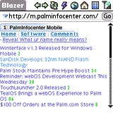
In addition I've also overhauled the mobile version of PalmInfocenter (m.palminfocenter.com) as well. It now offers registered users the ability to login in and comment right from your device while browsing the lightweight, mobile optimized site.
Article Comments
(62 comments)
The following comments are owned by whoever posted them. PalmInfocenter is not responsible for them in any way.
Please Login or register here to add your comments.
RE: Great News

This is a great improvement! Thanks Ryan.
RE: Great News
oopsie -= tried to reply to above and got...
The server encountered an internal error or misconfiguration and was unable to complete your request....
Ah geez
It's very ... white.
Need more Comments. That's how I kept up. Posted Comment in side is too few!!
RE: Ah geez
RE: Ah geez
EVERYTHING seems like an hallucination!
Hey Mike, your critics might say you spend your life in one great hallucination!
As a fellow (flu) sufferer here's to wish you a speedy recovery.
RE: Ah geez
RE: I'm having serious problems reading the font, at least for...
That should be - when I hit reply and/or make new comment, I'm having serious problems with the font. I just read the comments without replying etc and the font is fine.
RE: I'm having serious problems reading the font, at least for...
RE: I'm having serious problems reading the font, at least for...
RE: I'm having serious problems reading the font, at least for...
I've tested on all major browsers and have not seen any small font issues. What exactly are you using? If you can email me a screenshot that would be helpful.
Also you can change the font levels within your browser, maybe that setting is interfering or could fix your issue...
RE: I'm having serious problems reading the font, at least for...
I'm using Firefox, screen resolution is 1600x1200 (32 bits).
I'll email you two Bitmaps (thus no information loss); one will be of this area, the other of the comments below this in-progress reply. Two different fonts being used. THIS area has squished characters.
RE: I'm having serious problems reading the font, at least for...
RE: I'm having serious problems reading the font, at least for...
RE: I'm having serious problems reading the font, at least for...
RE: Excellent!
Hoping for a bit more colour though. It's just a tad too high key I think.
- Steve Smith
RE: Excellent!
Sharp Wizard->Palm IIIx->Casio EM-500->Dell Axim x5->Sprint Mogul->yet another prodigal son trying to find his way home
RE: works great
Brent
RE: works great
Very nice!
Thank you!
RE: good job :-)
Welcome to the true mobile Web 2.0: what Web 1.0 was before stinking Flash.
Palm III -> Sony NR610C -> Sony NR70 -> Sony NX80 -> Palm T|X -> HTC Kaiser -> HTC Fuze
About time... ;-)
One can only hope that you are not still running it on MS ISS...
http://tinyurl.com/2ooncg
comments from Treo 755
2. while doing the above I wnt to see if I could comment in the forums.
Error in my_thread_global_end(): 1 threads didn't exit
RE: comments from Treo 755
"twrock is infamous around these parts" (from my profile over at Brighthand due to my negative 62 rep points rating)
RE: comments from Treo 755
Content Encoding Error
The page you are trying to view cannot be shown because it uses an invalid or unsupported form of compression.
The page you are trying to view cannot be shown because it uses an invalid or unsupported form of compression.
* Please contact the website owners to inform them of this problem.
"twrock is infamous around these parts" (from my profile over at Brighthand due to my negative 62 rep points rating)
RE: comments from Treo 755
"twrock is infamous around these parts" (from my profile over at Brighthand due to my negative 62 rep points rating)
RE: comments from Treo 755
Posting on Tx
I bet you using a Pre will still be a pain compared to using a regular computer (except one with a virus).
'Latest Comments' window should always be on top
i know you want to sell software, but i would like to see the "Latest Comments" window moved up to the top. put "Software" "Latest News" etc. and all that other crap BELOW it. "Latest Comments" is the first thing i want to look at to see if there are any comment updates. i think MikeCrane agrees with me. any chance you can move "Latest Comments" to the tippy-top so my eyes don't have to go cross-eyed looking for this window among the sea of text on the right side of the web page wall? also, it would be nice if you can expand the box too to list more - maybe 20 instead of 10 if at all possible. and No, i don't want to have to click on "comment board" and go to another whole screen page. but putting it on TOP would be a great fix IMO.
THANKS!
RE: 'Latest Comments' window should always be on top
http://www.palminfocenter.com/comments/
I realize the one on the sidebar is smaller, but the dedicated page is much better and shows the latest 50 comments at a glance.
RE: 'Latest Comments' window should always be on top
no. i like to do a quick jump to PIC and do a quick glance to see if there's any new comments. before it was nice because the 10 new comments were all listed at the BOTTOM of the page (which was fine since it was easy to find). now, i must scan and scroll through a sea of text to try to find the new comments section. and no, i don't want to click off the main page to the big "comments board" just to see of there were any new comments. it's too cumbersome to do that. the BIG "comments board" is nice on those rare occassions when we get 20+ comments in a day on various topics and you have to catch up - but day to day, i just want a simple easy box of the last 10 comments which is easy to find.
again, please put the "10 Most Recent Comments" at the very top or the very bottom on the main page. this is the #1 thing my eyes want to go to when i enter PIC and i don't want it buried between seas of text. thanks.
p.s. sorry for the rambling - headache.
RE: 'Latest Comments' window should always be on top
Works great and a LOT better than having the comments at the bottom of the page - would I want the new "latest comments" section at the top (er..top-right?). Wouldn't complain about that but don't at ALL think it's necessary for "rapid and perfectly satisfactory PIC perusal"...
RE: 'Latest Comments' window should always be on top
As you likely remember from when I was beta-testing the site back in Dec/Jan, the only thing on the new site I am not fond of is the comments box on the right-hand side.
I liked the old one at the bottom of the screen for 2 reasons:
#1 It was a quick mouse scroll wheel flick (I use it the Logitech hyper-scrolling feature a LOT) or CTL-END key combo away (I also use home/end/pg up/pg down a ton-maybe an old diehard PC thing??)
#2 It showed more comments
I hardly ever go to the dedicated comments page unless I've been offline for a full day and there's been a big story with a lot of chatter (earnings report, new product announced etc).
I think that putting the latest comments up top would be overkill (especially considering how it's the "usual gang of idiots/regulars" doing most of the frequent posting here, but restoring it to its old location at the very bottom of the page is what I'd like to see.
As SV said, the dedicated coments board is, IMHO, too cumbersome to get to and having the small box on the right hand side as it is now is a bit less intuitive (it sort of gets jumbled up with the "special deals" ad & the "notable stories" feature etc.
Pilot 1000->Pilot 5000->PalmPilot Pro->IIIe->Vx->m505->T|T->T|T2->T|C->T|T3->T|T5->Zodiac 2->TX->Verizon Treo 700P->Verizon Treo 755p->?
RE: 'Latest Comments' window should always be on top
However, I don't quite follow why making one click on "Comments" in the top menu-bar is so cumbersome!
RE: 'Latest Comments' window should always be on top
top or bottom works for me. slapped in the middle of a sea of text on the right is not good. making it a "preferences" is no good because i don't always want to log in every time! and i don't want to click on comments every time. sometimes i shoot back and forth quickly from other sites - i just want to so a quick scan at the top/bottom of the page - and move on. don't make me unnecessarily call up a new page every time! yes, i know it's going to space but i want everything NOW! instantly!
i think MikeCrane agrees with me.
RE: 'Latest Comments' window should always be on top
-Bosco
m105 -> NX70v -> NX80v -> iPhone -> iPhone 3G
RE: 'Latest Comments' window should always be on top
[note for others - I use 1600x1200 on Firefox with a
"Bookmarks" left-side frame of about 1/5th the total display size]
RE: 'Latest Comments' window should always be on top
is it too much to GD ask to put the thing at the top?
RE: 'Latest Comments' window should always be on top
RE: 'Latest Comments' window should always be on top
You sound just like Chris Cornell.
-Bosco
m105 -> NX70v -> NX80v -> iPhone -> iPhone 3G
RE: 'Latest Comments' window should always be on top
Nuff said.
old browser issues?
When the pages load, my pointer goes nuts and IE locks for 15 seconds. Pointer shows a fast flickering hourglass next to the pointer, normal wait icon is a pointer with a spinning hourglass beside it.
I also get random areas of the screen where it is white (text not drawn)
If I drag a window over the blank areas, it will redraw and show the text.
I've never had any issues like this show up before. No clue what may be causing it. It is only on this site.
Other than that, the site just seems to be too white... maybe an off-white would be better for eye-strain?
Tungsten C, Tungsten E, Palm IIIxe, Wizard OZ-9520
"Quando Omni Flunkus Moritati"
RE: old browser issues?
But as an aside, there is no reason anyone should still be using IE6.
RE: old browser issues?
you mean you don't support all IE Browsers back to 1.0???
OUTRAGEOUS!!!!!!!!!
RE: old browser issues?
I personally know of several sizable firms where Win 2000 is still the most widely-deployed OS (from PCs of 2001-2004 vintage, so likely due to be upgraded soon but still)
A lot of companies transitioned from NT straight to 2k and have bypassed XP & Vista for any number of reasons. IE7+ are not compatible with IE6, so that's as good as it gets for Win2k unless you use a non-MS browser.
Pilot 1000->Pilot 5000->PalmPilot Pro->IIIe->Vx->m505->T|T->T|T2->T|C->T|T3->T|T5->Zodiac 2->TX->Verizon Treo 700P->Verizon Treo 755p->?


Latest Comments
- I got one -Tuckermaclain
- RE: Don't we have this already? -Tuckermaclain
- RE: Palm brand will return in 2018, with devices built by TCL -richf
- RE: Palm brand will return in 2018, with devices built by TCL -dmitrygr
- Palm phone on HDblog -palmato
- Palm PVG100 -hgoldner
- RE: Like Deja Vu -PacManFoo
- Like Deja Vu -T_W
Great News