PictureDial Released for the Treo 650
Toysoft has released PictureDial, a new app for the Palm Treo 650 smartphone. Picturedial mimics the picture speed dial functionality of the today screen on the Treo 700w. It allows you to have a "ribbon" of photo speed dials and you can also add application icons to launch apps as well. More...
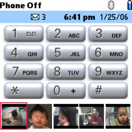 With Picture Dial you can dial any phone number and launch any application in main memory. You can add unlimited picture IDs to the Ribbon. The app supports any jpg image or you can snap a photo with the Treo camera.
Features include:
- Integrates with the Treo phone application
- Add unlimited pictures to Ribbon for dial and launch applications
- Dial any phone number
- Launch any application in main memory
- Use JPG pictures taken from the Camera application
- Use custom JPG pictures stored on the SD Card
- Easy access to picture IDs
- Cool animation of the picture Ribbon
- Supports up to 5 different phone numbers for each picture ID
- 5 Way compatible with one hand operation
- Intelligent Find. You can enter a partial number and Picture Dial will lookup the closest picture matching the number. eg: enter 123
- Move picture ID up or down and organize most used picture ID first
- Confirm before dialing the phone number
- Integrates with the Contact application for phone number lookup
PictureDial comes with a free trial. It costs $12.95 for the fully registered version, but is on sale for $9.95 until Feb 17th. It takes up 120k of memory and requires a external SD/MMC card.
Article Comments
(2 comments)
The following comments are owned by whoever posted them. PalmInfocenter is not responsible for them in any way.
Please Login or register here to add your comments.


Latest Comments
- I got one -Tuckermaclain
- RE: Don't we have this already? -Tuckermaclain
- RE: Palm brand will return in 2018, with devices built by TCL -richf
- RE: Palm brand will return in 2018, with devices built by TCL -dmitrygr
- Palm phone on HDblog -palmato
- Palm PVG100 -hgoldner
- RE: Like Deja Vu -PacManFoo
- Like Deja Vu -T_W
Needs a lot of work.
For starters, it's ugly. The white spaces between the photos, and the big white strip above do not gel at all with the rest of the Phone/Favourites screen. Secondly, it does not display the entire picture; it cuts off the bottom part, so you'll have a lot of people without chins. Thirdly, if you have more than two rows of Favourites displayed, they'll stick out about the "strip" of photos and add to the ugliness. Fourthly, it makes both the Favourites menu and the Calendar (if you choose to display a calendar event on the screen) completely inaccessible, by locking the 5-way to the photo strip.
Here's what it needs:
1)To actually display the entire picture, not the top two thirds of it.
2) To sit *above* the favourites menu, rather than on top of it, like the photo dialing on the 700w. As a matter of fact, the same exact spot would do nicely.
3) Some colour. Those white borderless spaces make it look like an unfinished hack, rather than an app we're being asked (and have paid!) money for. It would be sensible to make that colour the same blue as the rest of the Favourites menu, but user-definable would be even better.
4) An option to automatically add all Contacts with a picture associated to the Photo Strip, without having to go through the tedious process of choosing a name, then choosing a picture, then choosing a number. For those of us with dozens of contacts, it's simply too much effort to individually select it.
5) Have it scroll from side-to-side, rather than up or down. This will free up the 5-way nav and make both the Favourites menu and calendar events accessible again.
6) Enable the option to skip to a picture (or row of pictures) by pressing a keyboard letter. I realise this one might be tricky because the Favourites menu lays claim to the keyboard for press-and-hold shortcuts, and the Contacts app takes over as soon as you start typing. We can put it under the heading of "would-be-nice" rather than "must-have".
If all of the above can be done, I'll gladly pay another $9.95 for a new version. Right now, I'm feeling kind of cheated.
Tim Carroll
Your friendly customer service robot
(and big Treo fan)